Google released the third beta of Android 12 earlier today, and it comes with a litany of changes and improvements over the previous beta release. We’re still a bit away from the stable release of Android 12, though, but when it does, many users will be in for a surprise. Android 12 is shaping up to be the biggest update to Android in years, and Google is still not done adding new features before it launches. Android 12 Beta 3, for example, adds new features like scrolling screenshots, a smarter auto-rotate, and a whole lot more.
Navigate this article
- New user-facing features in Android 12 Beta 3
- Scrolling screenshots
- Better and faster auto-rotate
- Settings no longer uses colorful icons
- Material You’s dynamic theme is now customizable
- Themed icons
- Quickly copy links from the recent apps overview
- Disable swipe to invoke assistant gesture
- Media recommendations
- At a glance renamed to “Live Space”
- Storage settings show trash storage use
- You can turn off Wi-Fi from the “Internet” panel now
- Bubbles and PIP windows have a redesigned closing experience
- A revamped setup experience
- Game Settings
- Consolidation of one-handed mode and “swipe for notifications” gestures
- Miscellaneous changes
New user-facing features in Android 12 Beta 3
Scrolling screenshots
Perhaps the most exciting new feature added in Beta 3 is scrolling screenshots. Scrolling screenshots in Android 12 lets you can capture a screenshot of content that’s scrollable, so you won’t have to capture screenshots one by one and then stitch them together in an image editing app. OEMs have had their own scrolling screenshot implementations for years now, but Google has been working on a platform-level feature since last year’s Android 11 developer preview. Sadly, Google’s version didn’t make the cut for the Android 11 release, but it’s finally here in Android 12 Beta 3.
The way Google’s scrolling screenshots feature works in Android 12 is based on Views rather than the image stitching technique found in OEM software. When you capture a screenshot of content that’s scrollable, you’ll see a new “capture more” button in the screenshot preview. When you tap this button, Android extends the screenshot to show the whole screen for the user to crop. Here’s a brief screen recording showing off this new feature in Beta 3:
To make room for the new “capture more” button, the text has been removed from the other two buttons — share and edit — in the screenshot preview.
Currently, scrolling screenshots will work out-of-the-box for apps that use a standard View-based UI. Apps that don’t use a View-based UI or that use a heavily customized UI will need to implement the new ScrollCapture API to tell the system how to capture the screen. In Android 12 Beta 4, scrolling screenshots will support scrolling ListViews; support for capturing WebViews is in the works, but there’s no word on when it’ll be added.
Better and faster auto-rotate
In Android 12 Beta 3, Android’s auto-rotate screen feature has been enhanced. Google has optimized the animation and redrawing of the screen, and they’ve also added an ML-driven gesture detection algorithm. Overall, these changes reduce the latency of auto-rotation by 25%.
On the Pixel 4 and later Pixel phones, there’s another enhancement to auto-rotate that users can enable if they choose to do so. Under Settings > Display > Auto-rotate screen, a new “enable face detection” option can be found. When enabled, Android 12 will use the front-facing camera of your Pixel phone to more accurately detect when the screen should be rotated. This will hopefully result in fewer unintended screen rotations when you’re lying down. Google says that images captured by this feature are processed on-device within your phone’s Private Compute Core, meaning they aren’t stored in the cloud and never leave the device.

Credits: GooglePixels on Telegram.
Settings no longer uses colorful icons
The colorful settings menu icons have been muted. The icons used to look like this in older Android OS versions, so it may seem odd to see them return in Android 12. However, Google probably wanted to make the icons more consistent so they won’t clash with whatever theme “monet” generates from your wallpaper.


Material You’s dynamic theme is now customizable
On a more colorful note though, Android 12 Beta 3 makes “monet” more customizable. In Beta 2, once you picked a wallpaper, “monet” would automatically generate a theme for you, but you couldn’t change what palette to use. Google teased this palette-picking feature at Google I/O, and now, Beta 3 has added the updated WallpaperPicker app which adds this functionality.
After you apply a wallpaper in Android 12 Beta 3, you can go back to change the system theme colors. You can either go with the palette options that Material You dynamically generated from your wallpaper, or you can pick a “basic” color to theme the entire system. Depending on how complex your wallpaper is, you can pick from up to four palette options.


Interestingly, before you even apply a wallpaper, the wallpaper preview screen itself changes to reflect what palette Android 12 will generate from your wallpaper. This will let you see what theme Android will dynamically generate without needing to change your wallpaper. Of course, if you don’t like the palette that Android generated, you can change the system theme colors as we previously mentioned.
Themed icons
In the Wallpaper & Style app (AKA WallpaperPicker), there’s a new “themed icons” toggle. This toggle exposes the functionality that was hidden in Beta 2. When you enable this option, the icons for most Google apps will follow your system theme. Not every Google app is affected by this — on our devices, the icons for Chat, Find My Device, Play Games, and Tasks weren’t dynamically themed — but the vast majority of Google apps are supported by this.
Unfortunately, it looks like the list of app icons that get dynamically themed is hardcoded. No third-party apps follow the theme right now, though developers will be able to change their own app’s icon once the Material You libraries are released. Themed app icons also only show up on the home screen and not in the app drawer, Settings, or recent apps overview. This is certainly a neat feature, but it’ll be really jarring if just one icon on your homescreen doesn’t follow your system theme while the rest do.
Quickly copy links from the recent apps overview
The Device Personalization Services app on Pixel phones provides a handful of nifty features. Notably, the app uses OCR to extract text and images from the tasks in the recent apps overview.
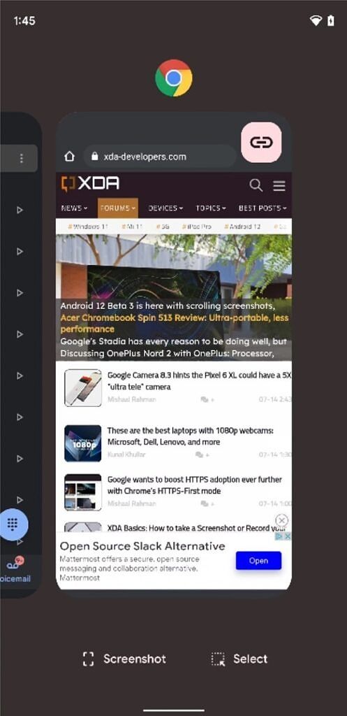
Starting in Android 12 Beta 3, a new action has been spotted in the recent apps overview. When you focus on a task that contains a URL — such as Google Chrome or Microsoft Edge — Android displays a link icon that, when tapped, lets you copy or share the URL.


We haven’t determined exactly how this feature works, but it doesn’t seem to be OCR-based. It’s able to pick up the full URL even if the entire URL isn’t shown in the recent apps overview. One user told us it worked for them on Reddit, so it may be pulling the URL somehow from the WebView.
Disable swipe to invoke assistant gesture
If you’ve ever accidentally invoked the Google Assistant by swiping up from the bottom of your phone, then you’ll be glad to know that Android 12 Beta 3 introduces a toggle to disable that gesture. It can be found in Settings > System > Gestures > System navigation > Gesture navigation (tap the cog icon.)

Media recommendations
In Android 11, Google moved the media player from the notification panel to a dedicated space underneath the Quick Settings panel. In Android 12, this media player has been refined and now looks much more integrated than before. Whenever the user pauses media playback, Android continues to show the media player under the Quick Settings panel so the user can quickly resume playback. The user can disable this behavior by going to Settings > Sound & Vibration > Media.
Now in Beta 3, this “Media” settings page has added another option: “show media recommendations”. This feature doesn’t actually work yet because it’s tied to the upcoming “Live Space” feature. Once it’s live, the “Live Space” widget will show media suggestions whenever an audio accessory like headphones are connected.


“At a Glance” is now “Live Space”
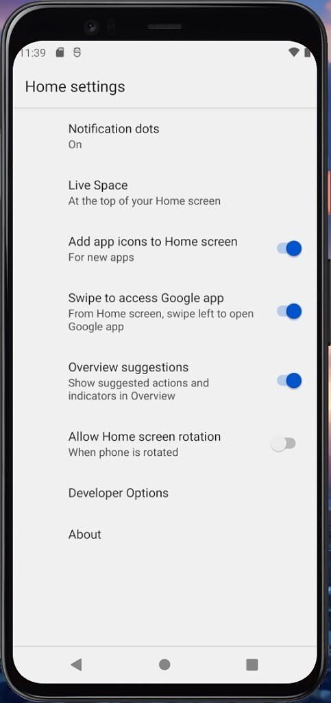
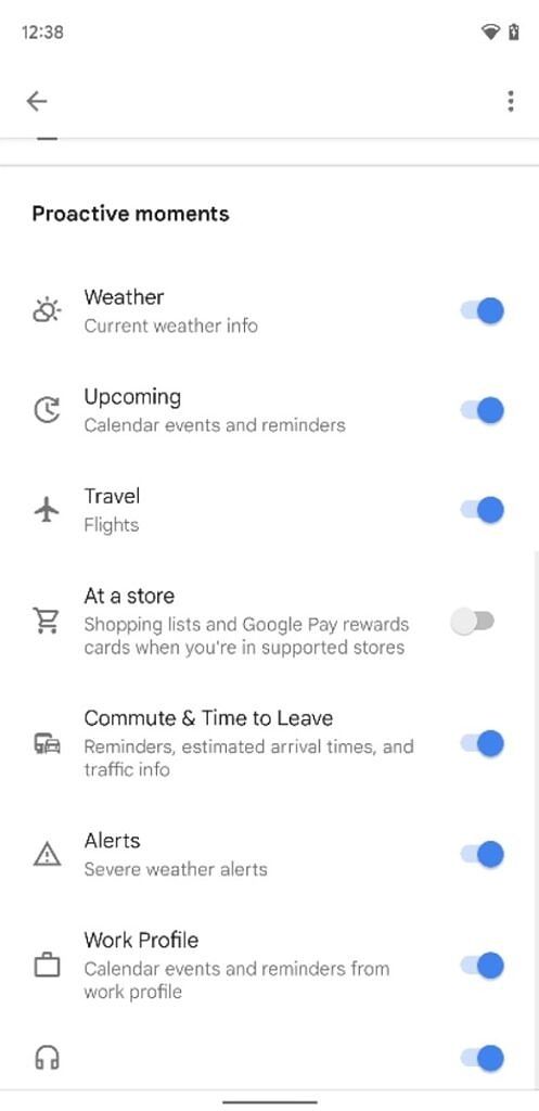
Speaking of “Live Space”, in Android 12 Beta 3, Google has renamed the “At a Glance” widget to “Live Space.” Right now, this is just a rebranding as no new functionality has been added. However, the new “Live Space” widget is set to gain a few new features that currently aren’t found in the “At a Glance” widget. These features include an “at a store” toggle to surface shopping lists and Google Pay rewards cards when you’re at a store, a mdia recommendations toggle, and information related to stocks, sports, and birthdays.
The first screenshot on the left is from Beta 3, while the two screenshots on the right are from our previous article covering the “Live Space” widget.


Storage settings show trash storage use
Your phone’s storage settings will now show you how much storage your phone’s trash is taking up. Well, technically it tells you how much storage all the files marked as trash are taking up on your device, as Android technically doesn’t have a single trash directory.
A few months ago, we learned that Google may be finally letting users manage their phone’s recycling bin, and this addition seems to be related to that. Trashed items on Android are currently hidden from most file managers as they’re prefaced with a ‘.’ in their filename, which is how Android understands a file should be considered hidden. These hidden trashed files are stored in the same directory where they were originally located rather than being moved to a system-wide Recycle Bin/Trash folder. When you tap on the “Trash” item in storage settings, you’re redirected to the Trash activity of the Files by Google app.

You can turn off Wi-Fi from the “Internet” panel now
The second Android 12 beta simplified the connectivity experience by combining both the Wi-Fi and mobile data tiles into one tile called “Internet.” When you tap on the new “Internet” tile in Quick Settings, it launches the “Internet” panel at the bottom of your screen, letting you change your Wi-Fi network or toggle mobile data. However, the simplification went a bit too far, as you couldn’t turn off Wi-Fi without tapping the Settings cog on your current network to dive into Settings.
In Android 12 Beta 3, however, you no longer need to dive into settings to turn off your phone’s Wi-Fi, as there’s now a toggle called “turn off Wi-Fi” in the bottom left of the Internet panel.

Turning off Wi-Fi in Android 12 Beta 3 still requires one more step than in Android 11, so if you want the ability to turn off Wi-Fi straight from the Quick Settings panel, you can make your own Wi-Fi toggle using an app like Tasker.
Bubbles and PIP windows have a redesigned closing experience
When you drag a bubble or picture-in-picture window in Android 12 Beta 3, you may notice a few changes. First of all, the close target (the “X” at the bottom) is now much larger. Second, there’s a neat snap animation for when the bubble or PIP window are near the close target. You can see both of these in action in the screen recording embedded below.
A revamped setup experience
If you factory reset your phone or buy a new Pixel, you’ll be greeted by the SetupWizard app. This app guides you through connecting to the Internet, adding your Google account, and setting up a few features, and in Android 12 Beta 3, it has a much more pleasant design that’s in line with the other Material You-themed system apps.


Game Settings
At the Google for Games Developer Summit, Google finally unveiled the long-awaited game dashboard feature for Android 12. Once this feature rolls out, you’ll be able to access a dashboard with key utilities like a screen recorder, screen capture shortcut, FPS meter, and Do Not Disturb toggle. The dashboard also has a shortcut for YouTube Live streaming, a Google Play Games widget, and a game optimization menu. In Beta 3, the game dashboard technically isn’t live for users yet, but we spotted a new “Game settings” page where you’ll be able to globally toggle the game dashboard and Do Not Disturb for games features.

Consolidation of one-handed mode and “swipe for notifications” gestures
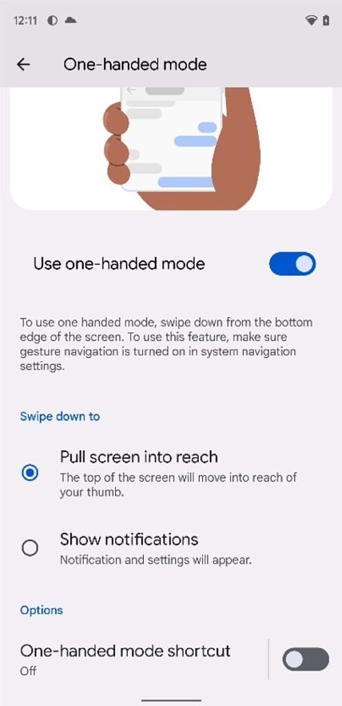
In Android 12 DP2, Google added a new “swipe for notifications” gesture that lets you swipe down near the bottom of any screen to pull down the notification bar. This conflicts with Android 12’s one-handed mode that was also added in DP2 because both gestures are triggered the same way. In Beta 3, Google got rid of the standalone settings page for the “swipe for notifications” gesture and instead moved it to the page for one-handed mode.

Miscellaneous changes
- The “Text and display” submenu under accessibility settings has added an experimental section. There’s nothing actually new here — it’s just more rearranging on Google’s part.
- An optional feature flag enables location indicator alerts, much like camera and microphone. However, given how frequently apps like Google Play Services accesses the location to provide location services for other apps, the indicator is more annoying than informative.
- A hidden “Advanced Security” activity lists various settings from the Security settings page. It seems Google may be cutting down on what’s shown in the main Security settings page by moving some of the less frequently used options to a dedicated page.
- The power menu settings page can now be found under “System” rather than “System > Gestures.”
- Since the device controls and quick access wallet feature are no longer part of the power menu, Android 12 Beta 3 displays a tip for the user telling them where these features have been moved to when they first open the power menu.
- A major overhaul to widgets is happening in Android 12, though most of the revamped Google app widgets haven’t been rolled out yet. To educate users about the new widgets, the Pixel Launcher will now display a help tip when the user first opens the widget picker.
- Notification settings have been rearranged. The general section is now up top, and “app settings” lets you quickly get into managing notifications for your apps.
- Pixel phones ship with Google Camera 8.3.252, which supports Material You’s dynamic theming.


With many inputs from Mishaal Rahman
The post Android 12 Beta 3 Changelog: All the new features and changes! appeared first on xda-developers.
from xda-developers https://ift.tt/3kiXkhK
via IFTTT


Aucun commentaire:
Enregistrer un commentaire